

Visual Arts
This is a selection of my work in visual arts. I started drawing when I was a child, copying my favorite cartoon characters. In 2001, I completed my first portrait — one of my grandfather who passed away shortly thereafter. The portrait was hung next to his casket at the wake. I'm not sure if that was the moment that sparked it for me, but it certainly plays a big role in my love for visual arts. Since then, I've tried my hand at just about everything, and only recently moving into digital mediums. Ultimately, I enjoy the work, and so whether or not it ever becomes a primary source of income is an afterthought. I will continue.
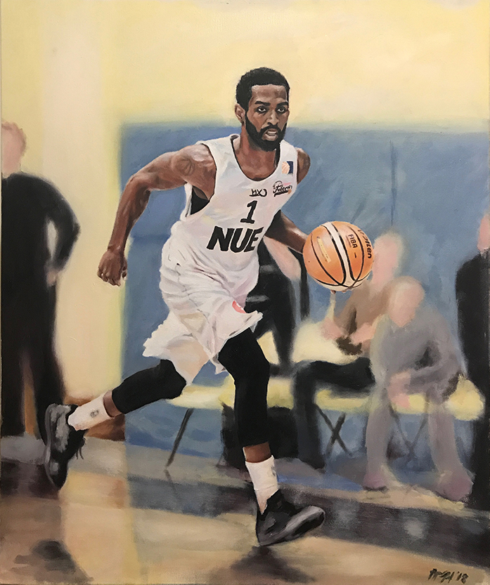
"Basketball" 18"x24" Oil on Canvas
This is my first ever commissioned work. I picked up oil painting in 2012 when I took my first painting class. Previously, I had only worked in pencil and charcoal, but I really enjoyed how nicely oil blends together.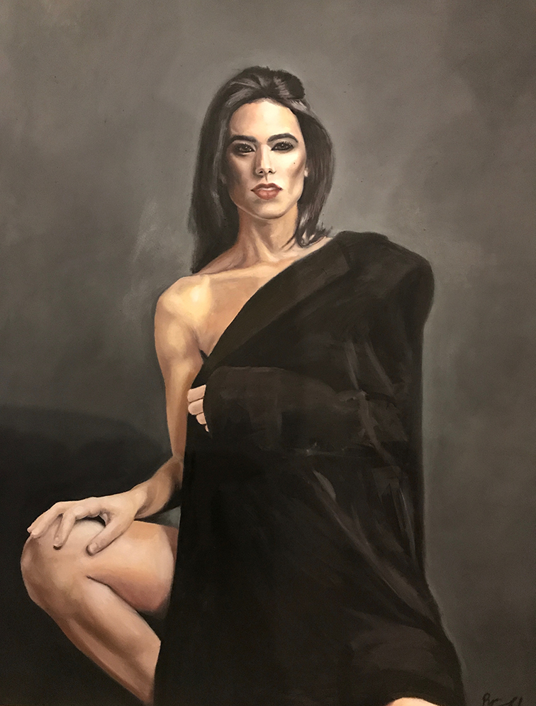
"Dana" 36"x48" Oil on Canvas
This is a portrait of my girlfriend, Dana. After about five years away from visual arts, I took on an otherwise ambitious project for myself. Working much larger than I was used to was something my college professors constantly prodded me towards, and I now understand why. Using a much larger surface gave me freedom to add as much or as little detail as I liked without it looking too busy or too plain. Oddly enough, I met a mutual friend at a bar in White Plains, NY who gave me some tips on "finishing the entire piece at the same time" — instead of finishing one small area and moving on to the next. He referred to it as "conservation of energy" and making sure each component was correct in both location, size, value... etc., prior to spending too much time perfecting it. I now understand just why that's so important, and this was my first opportunity to put the newfound knowledge to use.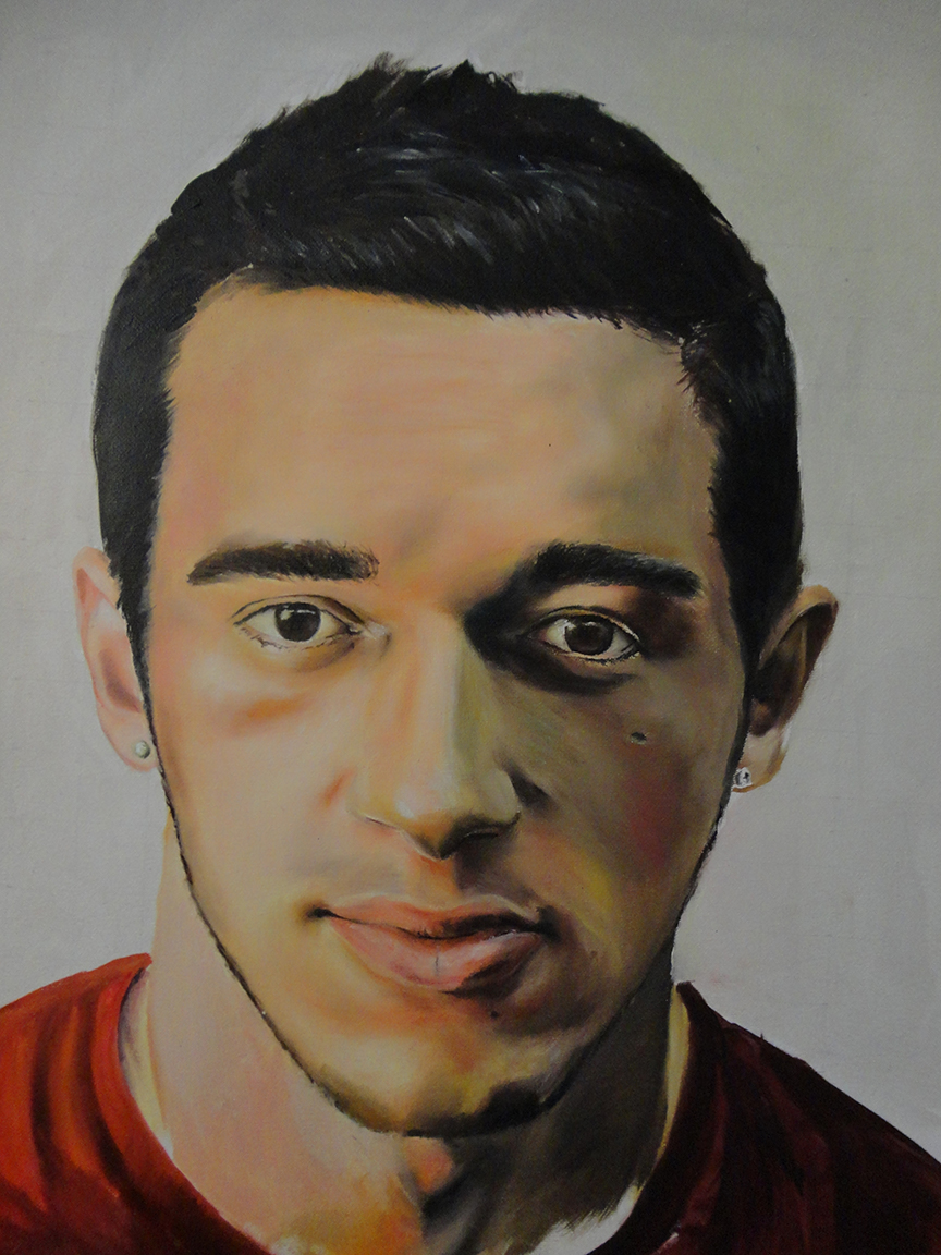
"Self Portrait" 16"x20" Oil on Canvas
My first oil painting ever. In 2012, I was a junior in college, and this was my final project. I remember working in the studio until late in the night (when I preferred to do my artwork), and I would put a brick in the door to let myself out for some air. It was a small college, so the security guards would let me in any time I wanted. Some of my fondest college memories took place in that studio.Years later, when I moved away to Los Angeles, my family back in New York put this portrait at the dinner table for Thanksgiving. They got a real kick out of it. I thought it was a little creepy, but hey...
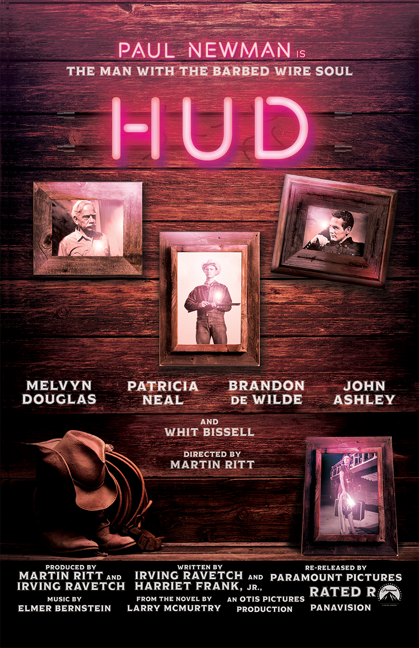
Hud Movie Poster
One of my first projects at Otis College was to redesign the movie poster for the 1963 Paul Newman movie, "Hud". I learned how to use Photoshop in High School, and kept up with it ever since, so I definitely felt like I had a strong starting point. This project was a fun one for me, and the concept developed quickly. I got to spend most of the time in execution, and it ended up being the first project that I received generally all positive feedback on. I guess you could say it felt like a milestone, so I'll toast to that.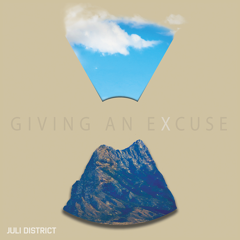
"Juli District" Album Artwork
As you may know from elsewhere on this site, I am a huge fan of music. So, when the assignment to design album artwork came my way, I jumped at the task. The band name was fictional (though I'd say it was pretty good all things considered), and so I modelled after a band I knew that liked to experiment with structure in their songwriting. I took that, along with the some inspiration from the LP name (also randomly generated) to create this concept. There is some visual symbolism at play — I used the toxic waste symbol as visual fodder, along with nuclear powerplant imagery derived from the smoke coming out of the top. Maybe an hour glass too — time's running out, after all...In any case, this was probably the project that I spent the most time on conceptually, and the abstraction that resulted is easily the most sophisticated I've been able to render. Take that for what it's worth.
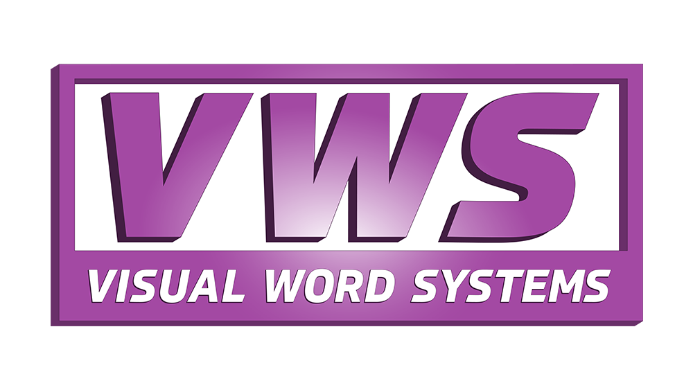
Visual Word Systems Logo
Now that I've begun to develop my digital art abilities, my work with Corporate AV has begun to expand. I'm now being tasked with creating various sales collateral, powerpoint presentations, pamphlets, and even logos. After a recent acquisition of a partner company, Visual Word Systems, the owner of Corporate AV asked me to design them an updated logo. They didn't have much to begin with, but the ask was to keep it simple — expand on the name and abbreviation, and maintain themes of speed of service and reliability.After studying logos of groups in similar spaces, I settled on a few variations. Of those, the skeleton of this one was the favorite. From there, I wanted the italics to drive home the speed of service, and the 3D nameplate design with sturdy edges to represent the reliability. In a nod to their business — high end video equipment — the gradient in the center is meant to represent the ’hot-spot’ found on projected images when projecting from the rear. It could also represent a sunrise in a separate nod to their 24/7 nature — whatever floats your boat!